Brand Redesign : Sydney Children's Hospital Foundation

Revamping Sydney Children's Hospital Foundation's brand expression

Role

UX/UI Design

Role

UX/UI Design

Role

UX/UI Design

Industry

Medical

Industry

Medical

Industry

Medical

Duration

3 Months

Duration

3 Months

Duration

3 Months

SCHF Folder Mockup
SCHF Folder Mockup
SCHF Folder Mockup

Brand Discovery

My team began with an in-depth audit of SCHF’s existing brand presence, analysing their visual identity, donor communications, and on-site experience. Through meetings and a foundation site visit, we observed how deeply the organisation supports sick kids and how strongly donors contribute to that impact. This phase revealed the need for a more cohesive and emotionally resonant brand system—one that better communicates SCHF’s message to corporate partners, families, and everyday donors.


Creative Direction


Building on our findings, we developed a refreshed creative direction that focused on clarity, warmth, and donor connection. We reimagined SCHF’s colour palette, typography, and shape language to introduce a more playful yet sophisticated tone. A structured design plan was created to guide both immediate touchpoint improvements and longer-term brand evolution.


Asset Development


  • Visual Identity System: Evolved the foundation’s colour palette into a more expressive set of purples, oranges, and soft neutrals, creating a modern, uplifting tone. Introduced a flexible shape system inspired by childhood play—abstract forms that could build scenes, icons, and patterns representing the world of children and care.

  • Brand Language & Messaging: Refined the brand’s tone of voice to better communicate the connection between donors and the children they help. Focused on storytelling that highlights impact, care, and optimism across corporate presentations, donor communications, and campaign materials.

  • Brand Guide: Compiled the refreshed elements into an extended brand guide, establishing clarity across logo usage, layout systems, shape building rules, colour pairings, and accessible communication styles for internal teams.

a cellphone leaning against a wall

Client Feedback & Iteration

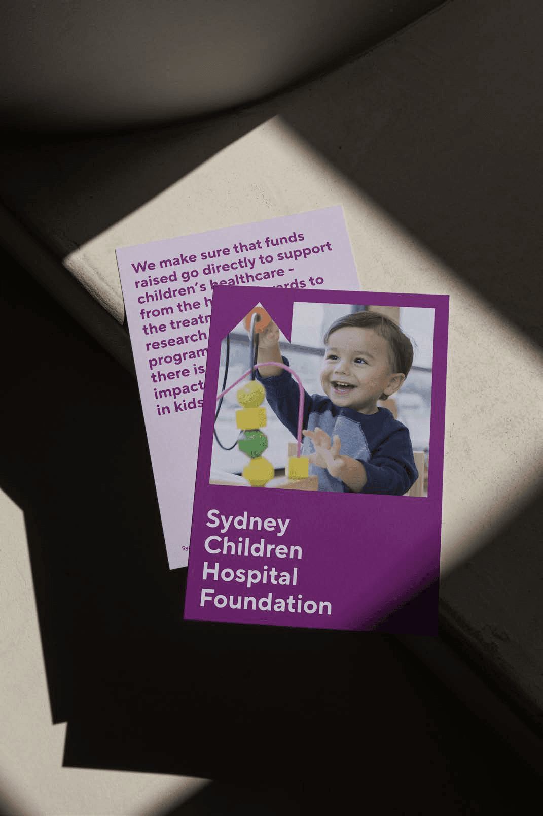
Presented the new brand direction to SCHF stakeholders, gathering feedback around emotional tone, versatility, and donor-facing communication. Through close collaboration, we explored how the updated identity could scale across events, digital touchpoints, and printed material. Iterative refinements were made to colour balance, shape combinations, and messaging structure to ensure the system felt distinctly SCHF—playful enough to represent children, yet polished enough to resonate with major philanthropic partners.

Implementation & Launch Support

Supported the transition into real-world application by preparing assets for presentations, donor decks, and campaign visuals. Provided clear documentation to guide SCHF’s internal teams, ensuring consistency in how the brand is applied across channels. Reviewed early applications of the new system and offered recommendations for future rollout stages, strengthening SCHF’s long-term brand recognition and donor engagement.

a cell phone on a ledge
a cell phone on a table
a cell phone on a bench

Reflections

The refreshed SCHF brand system was met with strong positive feedback, particularly for its ability to balance playfulness with professionalism. By expanding the colour palette, refining the brand language, and introducing a flexible shape system inspired by child-like creativity, we were able to create an identity that resonates more deeply with donors while remaining true to the foundation’s purpose. This project was a meaningful learning experience, strengthening my understanding of donor-centric design and the power of visual identity in shaping emotional connection, trust, and long-term engagement for organisations with an important cause.

Other projects

Contact me!

Let’s talk projects, collaborations, or anything design!

Contact me!

Let’s talk projects, collaborations, or anything design!

Contact me!

Let’s talk projects, collaborations, or anything design!