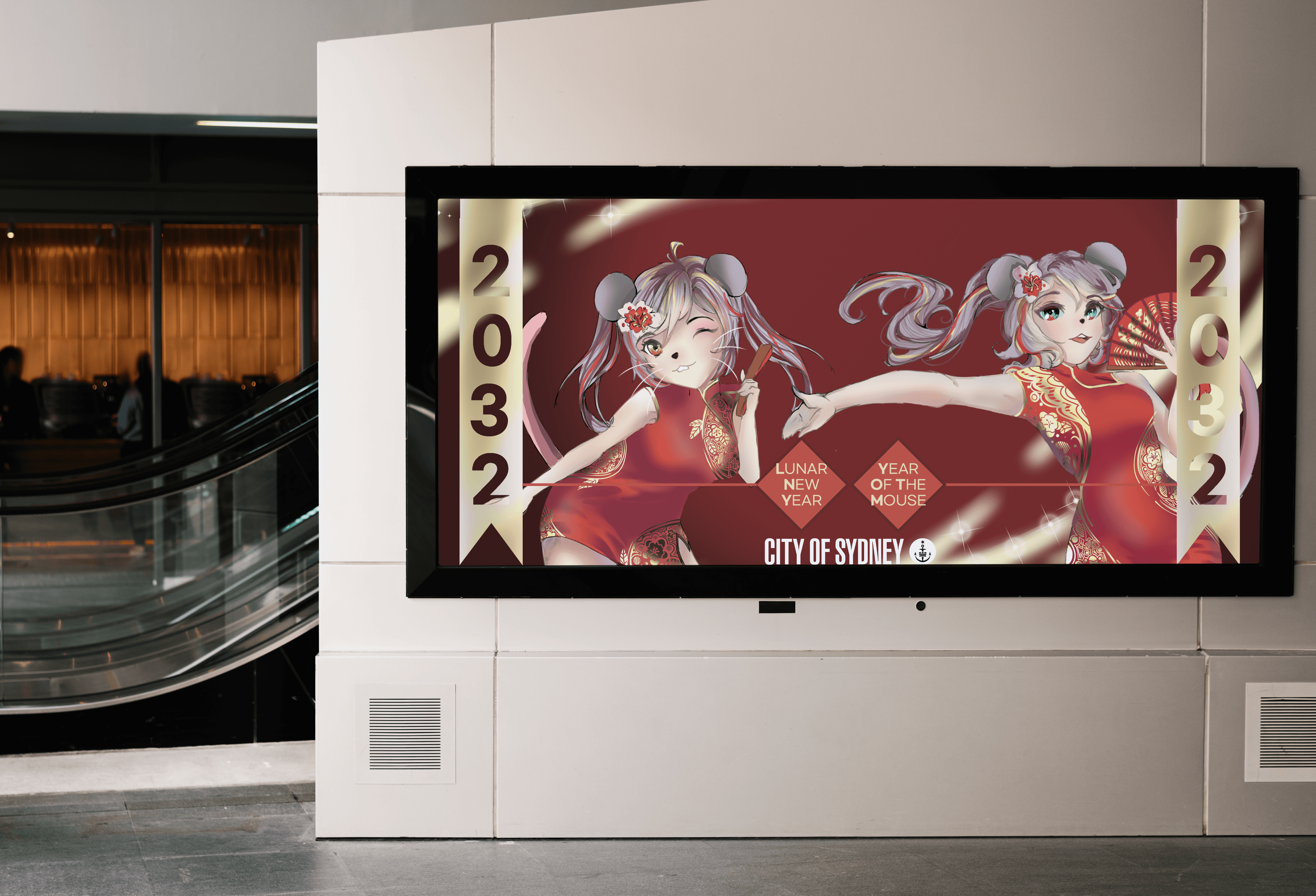
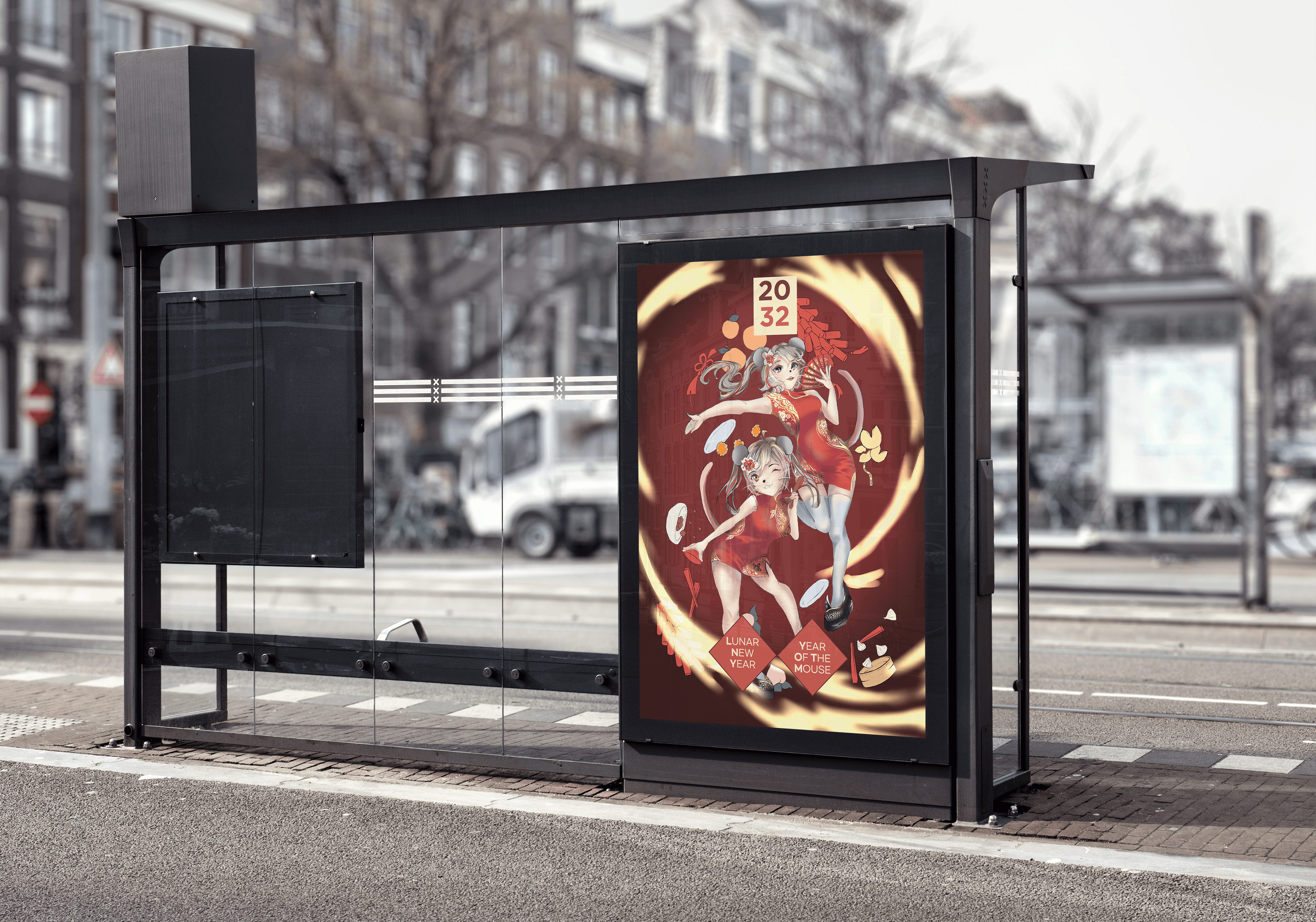
Illustration Project : Sydney Chinese New Year

Incorporating the celebration of Lunar New Year into the City of Sydney', expanding and incorporating cultural diversity.

Role

UX/UI Designer

Role

UX/UI Designer

Role

UX/UI Designer

Industry

Civil

Industry

Civil

Industry

Civil

Duration

2 months

Duration

2 months

Duration

2 months

a cell phone on a table

Cultural & Spatial Exploration

The project began with a deep exploration of how Lunar New Year traditions could be meaningfully expressed within Sydney’s CBD. I analysed cultural symbols, traditional motifs, and the atmosphere commonly associated with Chinese New Year, focusing on how these elements could scale into a large public environment. My previous experience refining brand language and visual identity systems helped inform this early research stage, guiding me to consider how culture, emotion, and visual storytelling intersect within public spaces.

Concept Direction

After investigating several potential aesthetics, I developed a concept centred around humanised animal characters—specifically the Lunar New Year’s zodiac. This approach allowed for expressive poses, dynamic compositions, and a more personal, relatable visual style. I focused on the Year of the Mouse, designing twin characters in traditional qipaos to visually communicate themes of celebration, family, and togetherness. This stage established the foundation for a vibrant yet culturally respectful spatial identity.

Asset Development

  • Illustrations & Key Visuals: Built detailed illustrations of the twin mouse characters using line work and rendered shading to achieve a clean, adaptable art style. Gold accents, festive patterns, and curved text were added to create a sense of richness and celebration.


  • Environmental Applications: Extended the artwork into a full spatial design system—bus advertisements, landscape banners, subway posters, and dual flagpole installations—ensuring each asset scaled appropriately while retaining clarity and festive energy.

a cell phone on a white block

Client Feedback & Iteration

Through class critiques and testing mock-ups, I identified areas where visual hierarchy, colour balance, and layout could be strengthened in real-world contexts. I refined the compositions by adding thicker gold detailing, adjusting text placement, and recalibrating character proportions to ensure they remained expressive at large scale. Iterations also addressed cultural clarity, such as enhancing year indicators and adjusting motifs to feel more distinctly Lunar New Year.

Implementation & Spatial Mockups

Final designs were applied across a variety of mockup settings—including building façades, transport shelters, street banners, and large-format billboards—to demonstrate how the system would function throughout Sydney’s CBD. These visualisations communicated how the artwork could transform everyday urban spaces into festive, culturally immersive environments. The project showcased the strength of combining expressive illustration with strategic spatial thinking to celebrate Lunar New Year within a contemporary cityscape.

a cell phone leaning on a ledge
a pair of cell phones on a concrete block

Reflections

This project was a testament to the importance of thorough user research and iterative design in creating solutions that truly meet user needs. It honed my skills in collaboration, problem-solving, and effective communication, setting a solid foundation for my future endeavors in UX/UI design.

Other projects

Contact me!

Let’s talk projects, collaborations, or anything design!

Contact me!

Let’s talk projects, collaborations, or anything design!

Contact me!

Let’s talk projects, collaborations, or anything design!